BIMBO
I'm chic
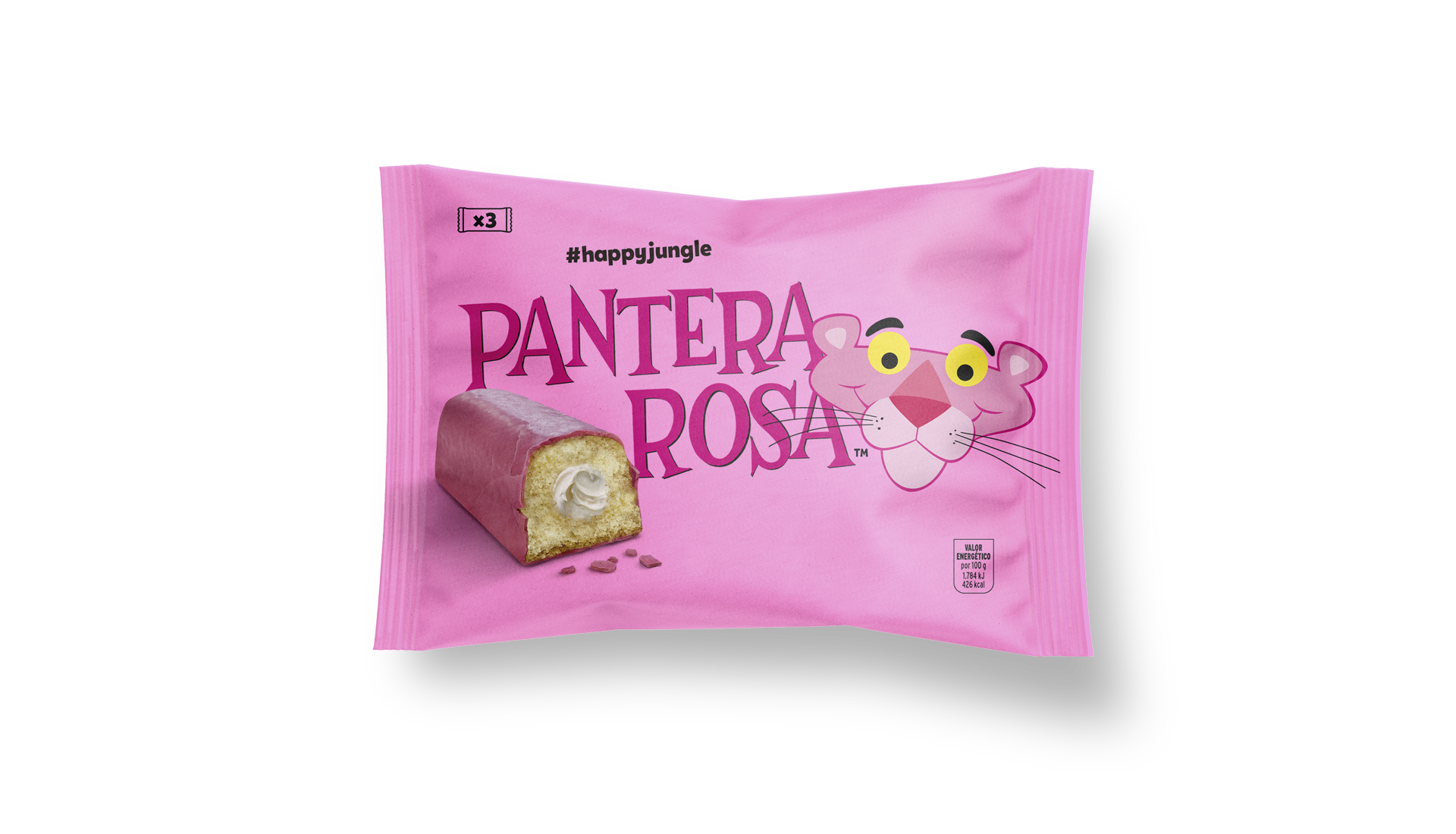
Pantera Rosa is one of Bimbo’s most iconic brands that challenged us to revitalize the design of its pink cupcake. The assignment: to redesign the branding and packaging of its range of cupcakes from the 70s. The objective: to reconnect with their most loyal audience -the baby boom generation- and to conquer the new generations. Our starting point is to maintain its vintage character, typography and original illustration style, but incorporating the product’s appetizing the product’s appetite and making a bolder use of color. The result: the new Pink Panther is pinker, chicer and tastier.
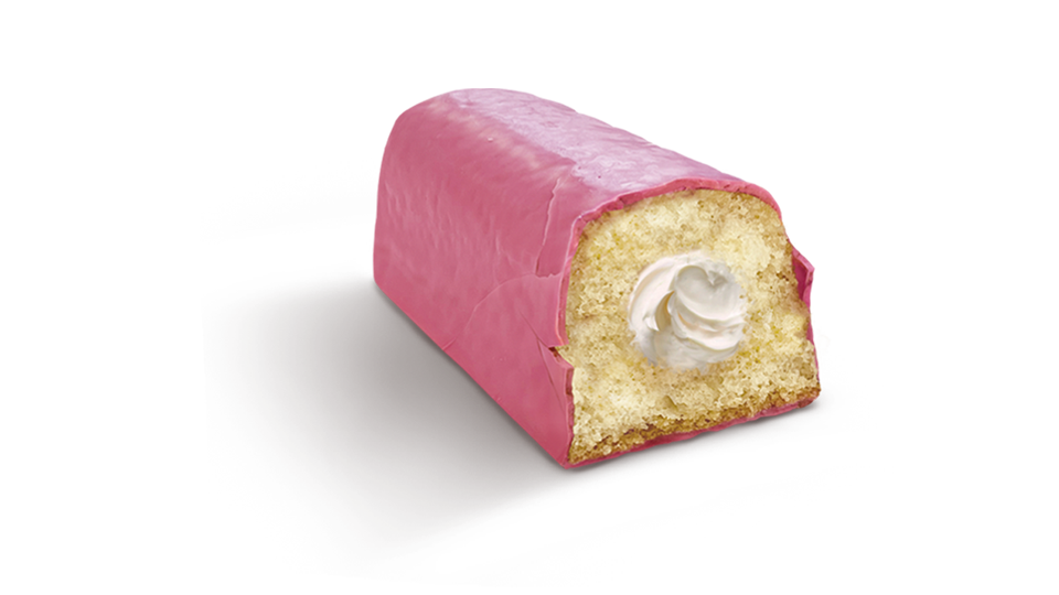
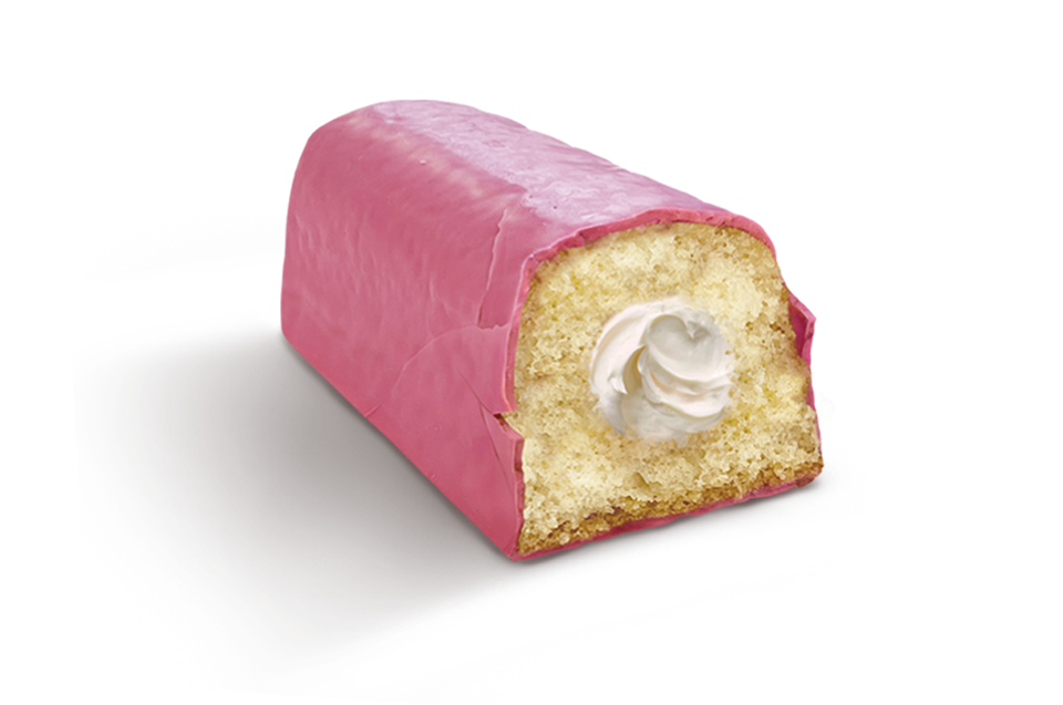
Pantera Rosa cupcake has recently turned 60 years old, and since its launch it has been one of the most iconic for the brand due to its pink color, its soft cream heart and the main character thanks to the agreement with MGM. Our design has stayed true to the character, and the pink color, and has given it a lighthearted and musical tone of communication, like the rest of the cupcake range. Naturalness, rhythm and indulgence with a beat.
After our update, Bimbo has managed to increase its cupcake sales by double digits in one year, once again standing out on the shelves thanks to this redesign.
I’m pink, I’m Chic & I’m very sabrosa!
Cliente
Bimbo
Work
Packaging
Sector
Food
Awards
Bronze Pentawards 2023
BIMBO
I'm chic
Pantera Rosa is one of Bimbo’s most iconic brands that challenged us to revitalize the design of its pink cupcake. The assignment: to redesign the branding and packaging of its range of cupcakes from the 70s. The objective: to reconnect with their most loyal audience -the baby boom generation- and to conquer the new generations. Our starting point is to maintain its vintage character, typography and original illustration style, but incorporating the product’s appetizing the product’s appetite and making a bolder use of color. The result: the new Pink Panther is pinker, chicer and tastier.
Pantera Rosa cupcake has recently turned 60 years old, and since its launch it has been one of the most iconic for the brand due to its pink color, its soft cream heart and the main character thanks to the agreement with MGM. Our design has stayed true to the character, and the pink color, and has given it a lighthearted and musical tone of communication, like the rest of the cupcake range. Naturalness, rhythm and indulgence with a beat.
After our update, Bimbo has managed to increase its cupcake sales by double digits in one year, once again standing out on the shelves thanks to this redesign.
I’m pink, I’m Chic & I’m very sabrosa!
Client
Bimbo
Work
Packaging
Awards
Bronze Pentawards 2023.
Sector
Food


